If your password is “password,” you’re not alone. Security analyst Mark Burnett recently harvested a list of publicly available passwords, and 4.7% of them are, yes, “password.”
The picture doesn’t get much better further down the list. 9.8% of the passwords Burnett found are either “123456,” “12345678,” or “password.” 40% of all passwords appear in the top 100 passwords, and 71% of all passwords appear in his list of the top 500.
The narrative most people take away from this is that we don’t understand passwords or security in general. “Most Common Password List Shows Shocking Lack of Imagination of Computer Users,” writes the Huffington Post. This massive population of tech-illiterate dim bulbs needs our help, goes the thinking; if they don’t choose better passwords, they’re all going to have their email hacked and their bank accounts drained – and, some might say, serves them right for using “password” as a password. They seriously need to get their act together.
From a designer’s point of view, though, the problem isn’t stupidity, laziness, or a lack of education about security. As user experience designers, we don’t treat users as the problem when a system doesn’t work. If 91% of students failed a test, wouldn't you assume that the test was the problem?
Soon, we’ll be able to do better than passwords, both in terms of security and usability. The best emerging solution may be one that combines elements of passwords, images, gestures and biometrics, as a recent article by Eben Kaplan in Information Security Journal proposes. But right now, we’re stuck with passwords. It’s unlikely you’ll be able to authenticate yourself at the bank by tracing a custom pattern around an image with your eyes while your retina is scanned anytime in the next few years.
But even though we’re pretty much locked into the password paradigm, we can still improve the authentication experience. If you’re thinking through a site or an app, here are a few straightforward design practices you can use right now.
- Don’t impose maximum lengths. People are used to minimum lengths. But there’s no design or security advantage to limiting their passwords to fewer than 10 characters. Charles Schwab is one of the worst offenders, limiting passwords to 8 characters.
- Allow copying and pasting in password fields. When people use a password manager to create super-strong passwords like, say, “x@#nSA9*g$HsoPNW(qov,” don’t punish them by making them type that gibberish out by hand.
- This one may be unpopular, but here goes: on small mobile devices, don’t obscure the letters that are already typed. It’s hard to get the letters right on a tiny keyboard, and leaves people confused about whether they’re misremembering or mistyping their passwords. As anybody who’s ridden a city bus knows, it’s much easier to visually eavesdrop on a large laptop screen than a tiny, hand-covered mobile screen.
- Finally, be careful with content restrictions. Allowable passwords vary wildly across the internet.
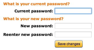
Amazon has no restrictions at all.

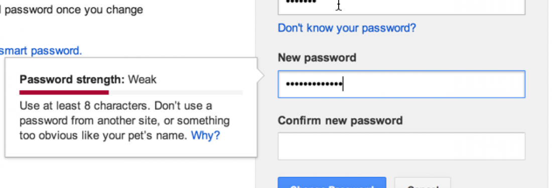
Google requires 8 characters and disallows dictionary words.

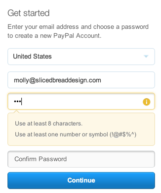
PayPal requires 8 characters, including 1 special character.

And the California DMV requires... well, see for yourself.

You’d think websites with annoying password policies would feel the sting of user abandonment and shape up. Unfortunately, websites with frustrating, arcane password policies are likely to be the ones you can’t avoid. Researchers at Microsoft found that websites that need to attract and retain users (think Amazon or Paypal) are much less likely to enforce stringent password rules as websites where users don’t have a choice (think DMV).
We want users to pick different passwords for different sites, but we drive them crazy when we constantly switch up the rules. We want them to pick strong passwords, but they frequently don’t (and then we ridicule them). Is it time to give up on passwords? Check out my next post, a designer’s eye view of some emerging authentication patterns.


