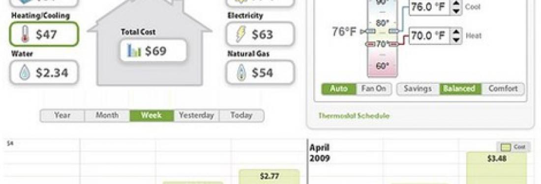
A recent SmartGridNews.com article praised Greenbox Technology for “deliver[ing] understanding to utility customers.” While Greenbox does provide useful functionality that differentiates it from its competitors, key improvements to its interaction design would go a long way to provide a better overall user experience.
The Good
To be fair, Greenbox does deserve a gold star for displaying energy data specifically in dollars($). As I mentioned in an earlier post, consumers don’t understand energy units, such as kWh, and are motivated to change their behavior by saving money.
The Not So Good
But, what about the rest of the Greenbox design? Greenbox gets caught up in the same usability pitfalls I’ve seen in other consumer energy portals as well --too much information and not enough direct reference to the things that matter most to users. Here are my top three suggestions to help Greenbox, or any consumer energy portal, deliver an excellent user experience:
- Simplify, simplify, simplify! My foremost suggestion is simplicity. At first glance, the Greenbox interface looks very busy. There are many controls and buttons, and it tries to accomplish too much on a single page. Do users really need to be able to adjust their thermostat controls right on the main landing page, and also view their overview and data details at the same time? Instead, the home page could show only the most important information at first glance, and use color to further highlight and differentiate content on the page. The user can always drill-in to inside pages to access the less urgent information or access info on mouseover.
- Engage users immediately with compelling content and proactive recommendations My first response to the Greenbox dashboard is, “So what?” I’m missing context to understand the significance of my data. For example, is my overall usage good or bad? Am I using more or less energy than I did last month? Am I on track so far this month? Also, the portal doesn’t offer any suggestions for changing my behavior so it’s unclear what my next step should be. To engage its users, Greenbox should focus on delivering insightful content that immediately provides context and motivation. Delight users by anticipating their questions and displaying answers at-a-glance. Provide simple charts and visuals on the dashboard to compare energy usage to different time periods and to others in the community so that people understand why this information matters.
- Adhere to basic design principles In addition to overall experience enhancements, here are some basic user interface guidelines to help GreenBox or any other site be more usable:
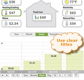
Use clear titles
Is the bar chart below showing data for all energy resource usage, just the electricity usage, or only heating and cooling (because that’s what is selected in green)? It’s hard to know for sure without a clear title for the chart.
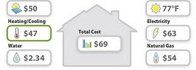
Use visual cues to help users appropriately group related items
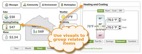
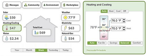
Instead, GreenBox could make these two items more visually related to connect them. For example, put the same green border around the box on the right and give both elements the same background color (see update below). Then, I would be much more likely to quickly understand their relationship.
Updated design with green box:
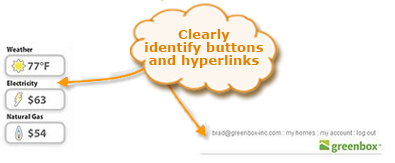
Visually identify hyperlinks & interactive features
To help users understand what’s clickable, it’s important to differentiate hyperlinks and interactive features from other static elements on the page. For example, on the GreenBox site buttons and links currently use the same dark text color as other static elements, which makes them difficult to identify.
A Minimal Redesign Idea
If we take the recommendations above and do a very minimal redesign of Greenbox limiting ourselves to only minor changes to content and layout, we already begin to see large improvements in terms of usability.
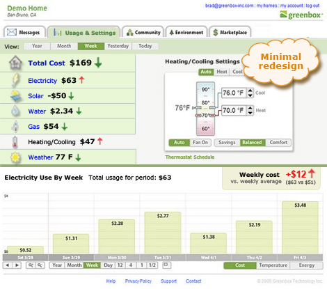
For example, in this minimal redesign, the relationships between content is clearer due to stronger visual cues and use of titles, the interactive elements more readily “pop” from the page, and inclusion of arrow icons begin to tell an interesting story about the user’s energy consumption.
But we’re not done yet…
Of course, it would take GreenBox more than just a simple redesign with no change in functionality to address all of our recommendations. As a next step, I think Greenbox would benefit to take a more critical look at its overall structure and content to ensure they lend themselves to a good user experience – in particular thinking about the best items to put on the home page and trying to answer the question “So what?” Will we see a new and improved Greenbox site in the near future? We hope so. In the meantime, let’s learn both from the things that Greenbox does well and from the areas that Greenbox falls short so that we can continue to focus our energy on creating intuitive, meaningful, and persuasive user experiences.
Related post: Watts all the buzz about smart grid energy?


