Zebit
No fees, no interest, no credit check - sign me up!
Zebit is a game-changing platform that helps budget-conscious shoppers with less than perfect credit shop smart with an interest-free line of credit.
But there was a catch: Zebit had potential to greenlight must-have purchases, but many potential customers were skeptical about signing up. We came in to spruce up Zebit’s sign-up process, grow conversion, and unlock new possibilities.
Case Study
Shopping revolution? Give me smart, savvy options.
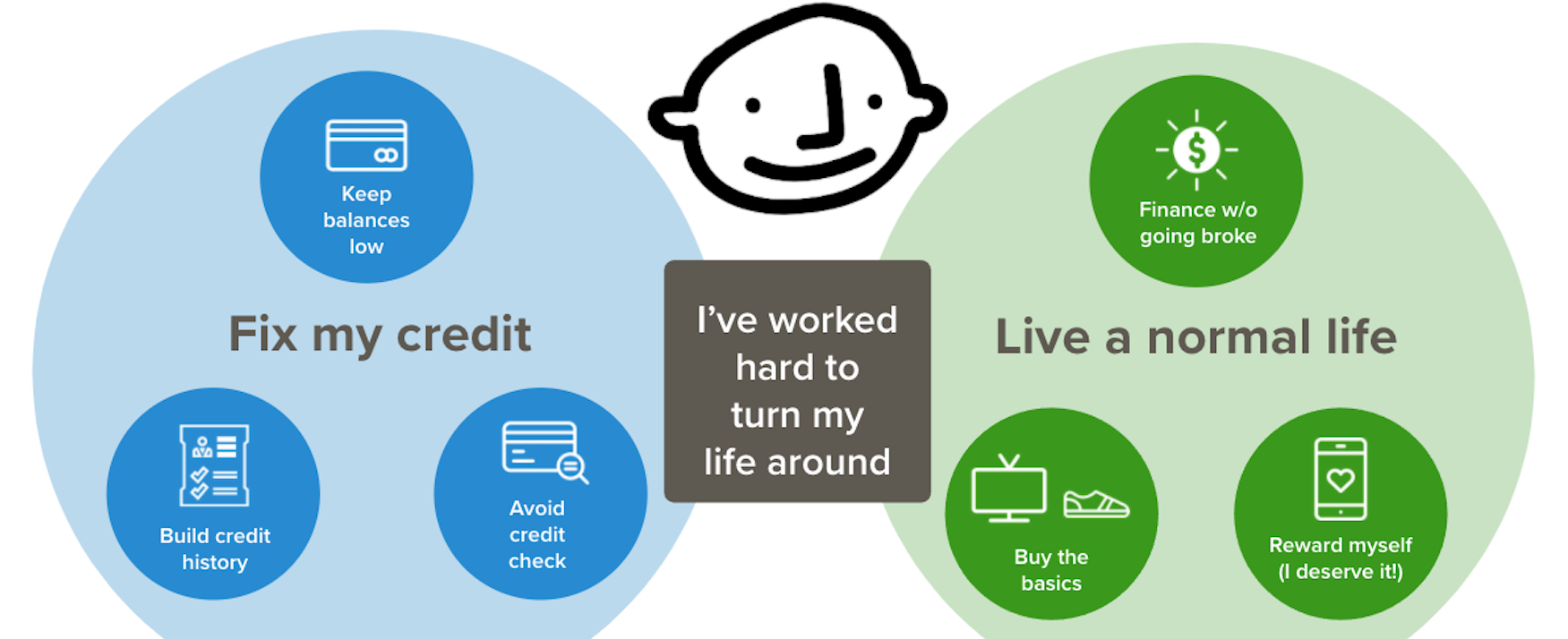
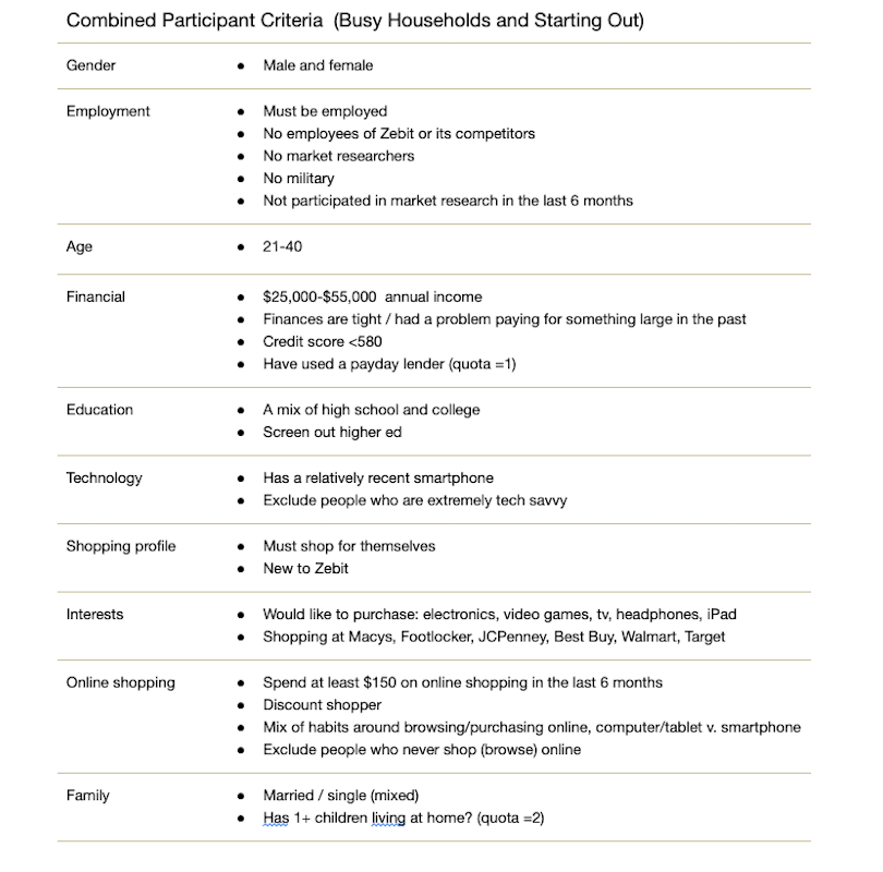
Our journey kicked off with a remote study, engaging six experienced online shoppers with poor credit. We discovered that despite their financial tightrope, each participant shared a sense of pride in their progress and a shrewd awareness of their credit situation.
For these savvy customers, shopping meant strategizing on financing and conducting meticulous research on the purchasing process. If the process was too heavy a lift, it simply wasn't worth their time. This meant that Zebit had to establish trust by providing ample yet accessible information and ensuring these customers felt comfortable sharing personal details.
From Post-its to putting it all together.
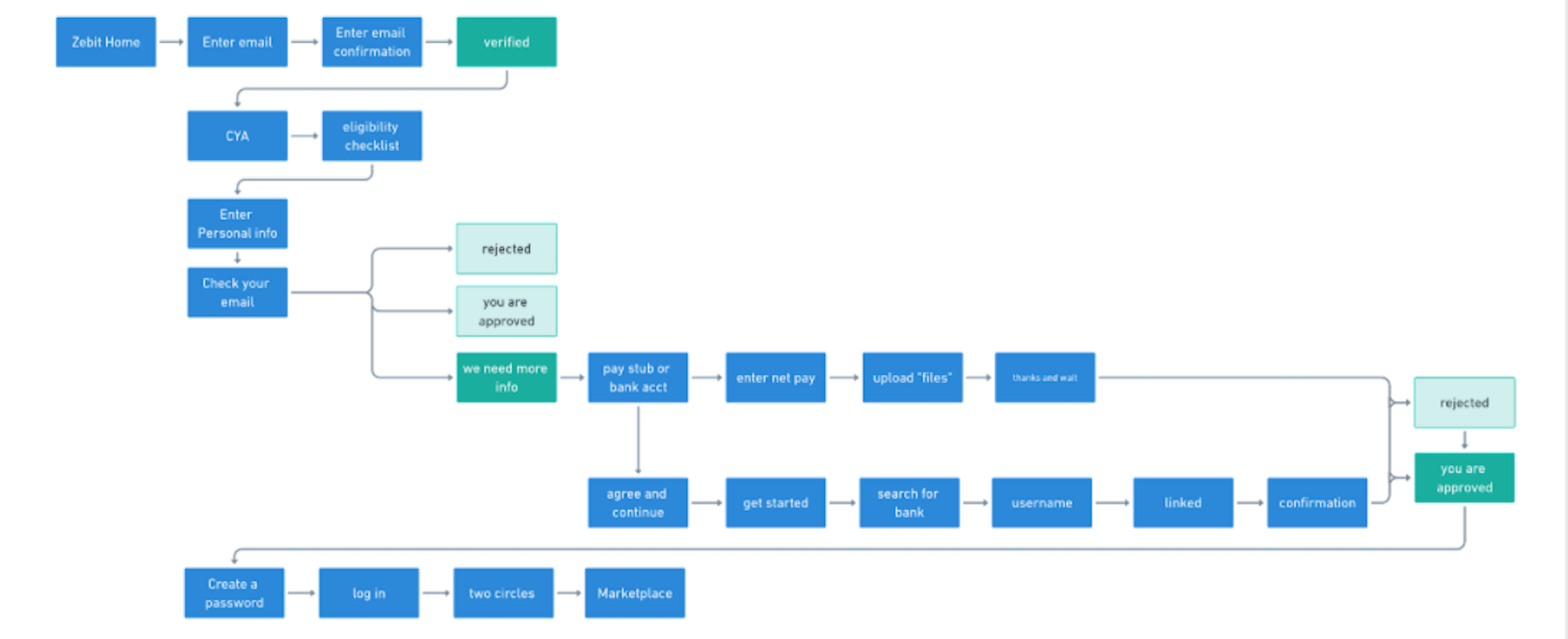
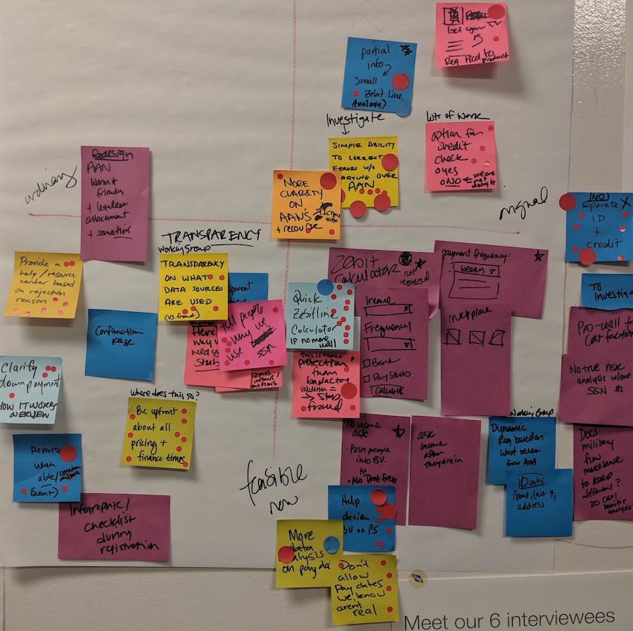
Next, it was time to sprinkle some magic on Zebit's process, making it irresistible to customers. Armed with the results of lively brainstorming sessions, we set out to simplify key steps for users.
Ideas revolved around:
- Transparency: Crystal-clear explanations of how Zebit operates and validates customer credit applications and sharing pricing details upfront.
- Barrier removal: Make registration optional until checkout and empower users with insights to boost their credit line.
Trust is the name of the game.
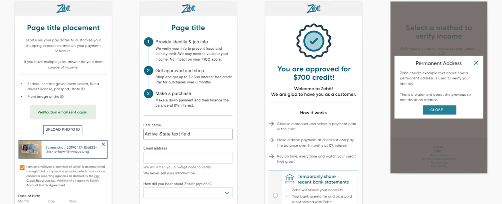
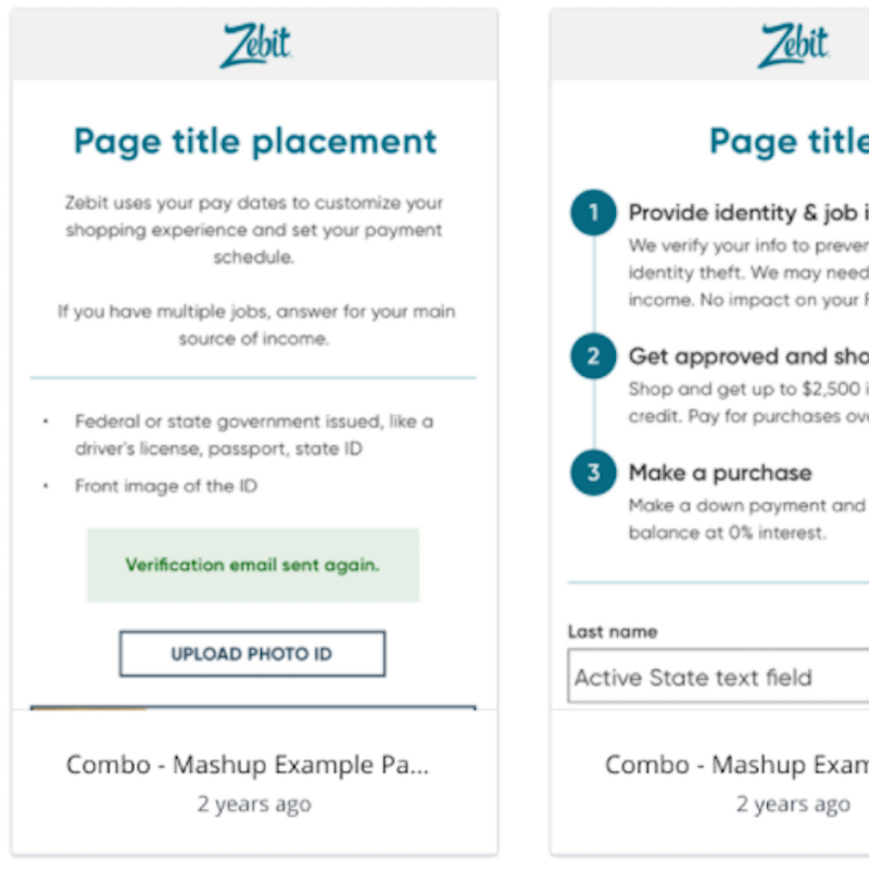
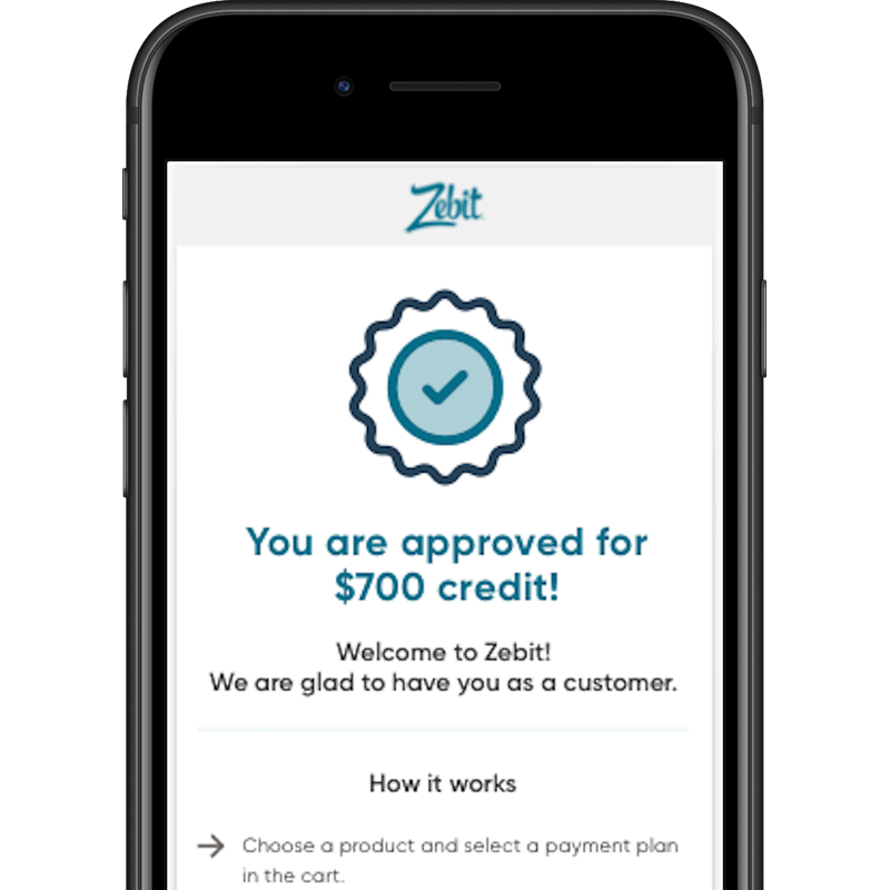
With redesigned sign-up flows and fresh screens in hand, we invited users to test our prototype on Invision. Their feedback highlighted a major concern: inputting personal information like social security numbers or bank account details still made users uneasy. Since these users were new to Zebit, they viewed any requests for information as an invitation to identity theft. In order to win over users' trust, over-the-top transparency about everything was key.
Sweep out all the dark corners.
The bottom line: Even though we thought we had explained everything, these users had been burned so often in their finances that they had questions about every nook and cranny.
We went to work removing any fields that were not absolutely required and refined explanations to be even more simple, direct, and everywhere. Final testing showed that customers got it and were grateful that a financial site could be this upfront.
The Results
Zebit swiftly incorporated Sliced Bread’s fresh ideas into their production site. Within two months, their new designs were unveiled, resulting in a substantial increase in sign-up completion rates. Zebit was over the moon with the outcome, and they integrated user research into their product development process moving forward.


