Recently, I discovered a new prototyping tool for creating rough, sketch-style UI designs called Balsamiq Mockups. It’s basically a lo-fi mockup tool with a built-in library of sketch-style UI elements that can be easily dropped onto a workspace and edited. After test driving this tool on my own, I decided to see how Balsamiq Mockups sketches compared to rough HTML wireframes in the context of a user study.
First impressions using Balsamiq
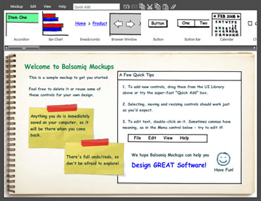
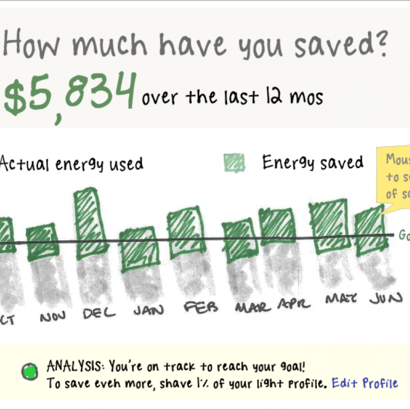
After demoing the tool for only a few minutes, I thought, “Wow, nice job!” It was fun to play with, drop dead simple to use, and required no tedious application tutorials or programming knowledge in order to just dig right in. I liked how quick and easy it was to drag and drop library items into the workspace and quickly adjust and rearrange them as needed. After only a short time using Balsamiq, I could create simple mockups just as fast (if not faster) than I could in Dreamweaver, the tool I use most frequently for rapid prototyping. I also found it very easy to export my Balsamiq sketches as static files and add interactive behaviors on top of them using hotspots. However, the real strength of Balsamiq comes from the fact that the tool does not simply emulate other prototyping tools that make realistic-looking mockups (such as Visio, PowerPoint, GUI Design Studio, and MockupScreens). Instead, Balsamiq takes an entirely different approach and deliberately uses a rough, hand-drawn look and feel -- presumably to better communicate that these designs are just early ideas in-progress and are not fully fleshed out yet. I hypothesized that Balsamiq Mockups would be especially good for communicating early design concepts, to keep users focused on the high-level ideas, rather than on the details. [more538]
Balsamiq vs. HTML usability test
To test my hypothesis, I conducted a comparison study to find out if the sketch-like quality of Balsamiq mockups had any effect on the type of feedback that users provide in the context of a study.
The Research Process
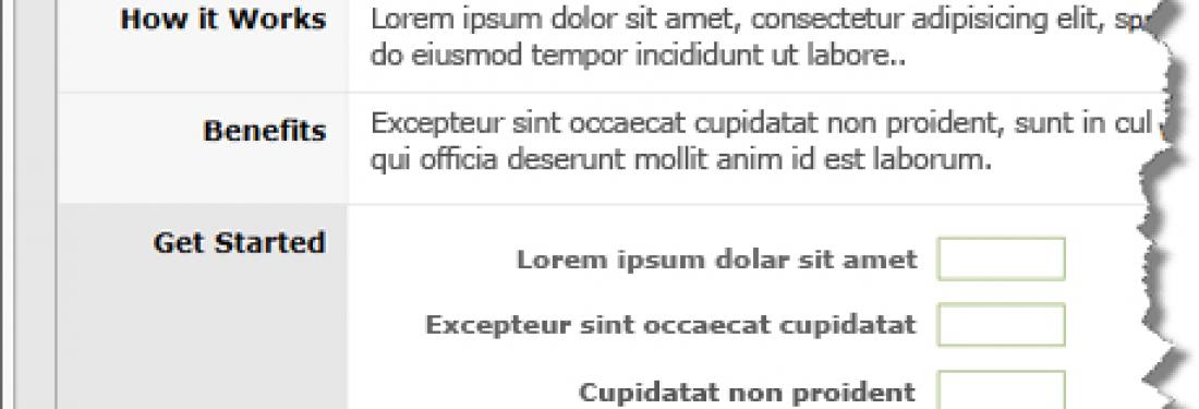
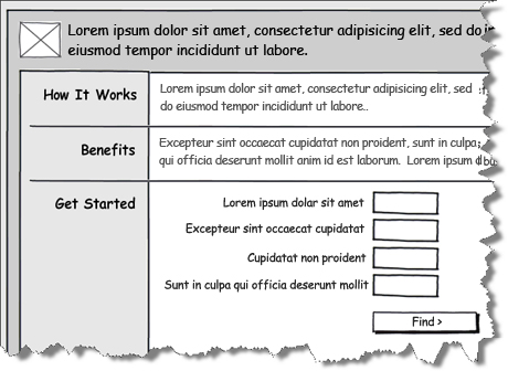
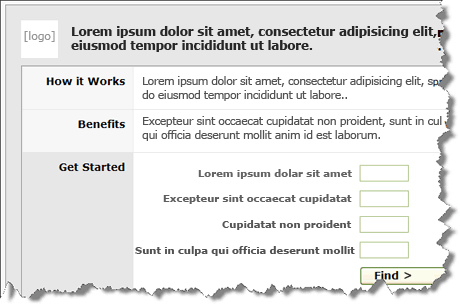
For the study, I used an A/B test format. First, I mocked up the same high level design using two different methods: version one was created in Balsamiq, and version two was a very rough, grayscale, HTML wireframe created in Dreamweaver. Then, I showed half the participants the version one Balsamiq sketch; the other half of the participants saw the version two HTML wireframe. (See images below with text blocked out for client IP reasons)
Version 2: HTML wireframe
In both cases, I told users to share their initial impressions about the design. I explained that the designs were still a work-in-progress and I was looking for high-level feedback regarding the concept and overall functionality, rather than the specific language, details, or look and feel of the page. I then noted their feedback to see if there were differences between the two groups.
The Results
All participants were able to provide high-level feedback about both types of mockups. However, participants who saw the Balsamiq sketches were slightly less concerned with the details and specifics of the design. They tended to comment less on the colors and appearance of the design, as well as the particular language and text used. They were also more aware of the fact that they were looking at an in-progress design, making comments such as, “I don’t really like the way this dropdown menu works, but know the design for it might change later anyway.” In both cases, users still made comments on specific page interactions, but the Balsamiq participants were more likely to be aware that this type of feedback was overly specific, as one participant qualified his feedback by saying, “I guess that’s not really the kind of feedback you’re looking for right now.” Overall, I found that the participants who saw the Balsamiq sketches did a slightly better job of keeping their feedback more conceptual than the participants who saw the HTML wireframes. However, participants in both cases still commented on some of the details of the mockups as well, and it was necessary to use the moderator questions to guide the user’ focus and attention back to the level of feedback I was looking for.
Conclusion
Balsamiq Mockups is a useful new prototyping tool. It’s perfect for sketching quick ideas and sharing with others, especially if the mockups are fairly simple in layout and overall complexity. It’s also a great tool for concept testing with users, as the sketch-like quality of the designs works well for gathering high-level feedback on initial design ideas.


