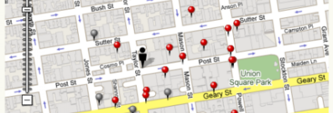
Open Table recently introduced a new mapping feature that displays restaurant info. Putting info on a map is a solved problem. Google, Yahoo! and many other sites have successfully mapped information with mouseovers and Open Table could have easily reviewed these sites and put together a design that capitalized on best practices. Instead, the Open Table interaction is awkward, resulting in an experience that is difficult and unwieldy. Sigh. Let this be a lesson to those putting together mapping interfaces on what you should and shouldn't do. Here's our list of key mapping tips:
- Allow the user to close boxes they opened on click. This is the most important tip here. In Open Table, when you click on a map marker, it opens a window that covers up the other restaurant markers on the page and there is no way to close it. Sometimes I noticed at random times the window would close on its own, but it did not have an X in the corner so was super annoying.
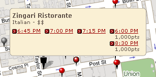
- Visually connect the pop-up with the map marker. As you can see in the screenshot above, Open Table does this quite subtly. The map marker in the middle has a black outline and a slightly brighter white spot. Uh-uh. This is not the time to be subtle. POINT to the marker that the hover refers to so that the user does not have to remember.
-
Consider if you need to have both on hover and on click interactions. If you present different info on hover and on click, make sure that there is a reason why you are not presenting the info on hover to start with. Check out the difference between on hover and on click in Open Table:
On hover

On click

Note that the box does not get bigger on click, leading me to wonder why they don’t just display the time info on hover. Even if the times sometimes wrapped to a second line as shown below, it's still a pretty small box. On click, 2 lines:
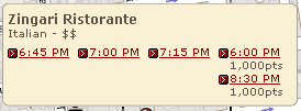
- Display the information in an order that makes sense. This tip, of course, applies to anything you design. In the screenshot above with the four times, Open Table is displaying 6 and 8:30 PM at the end of the line, presumably because you get more points for going at those times. I’m used to time data being display chronologically. I dunno why. Must be something about the fact that it’s time.
A Good Example
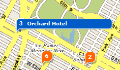
Now for an example of what we consider a good map interaction. A while ago we designed a map interaction for hotels for Yahoo! that never got launched so I'll share it here because it illustrates the points above. Here's how it works: On hover is simple with just the hotel name:
The on click pop-up reflects all the recommendations from above:
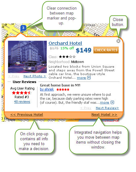
This solution is elegant and informative. If only we could see the same at Open Table.


