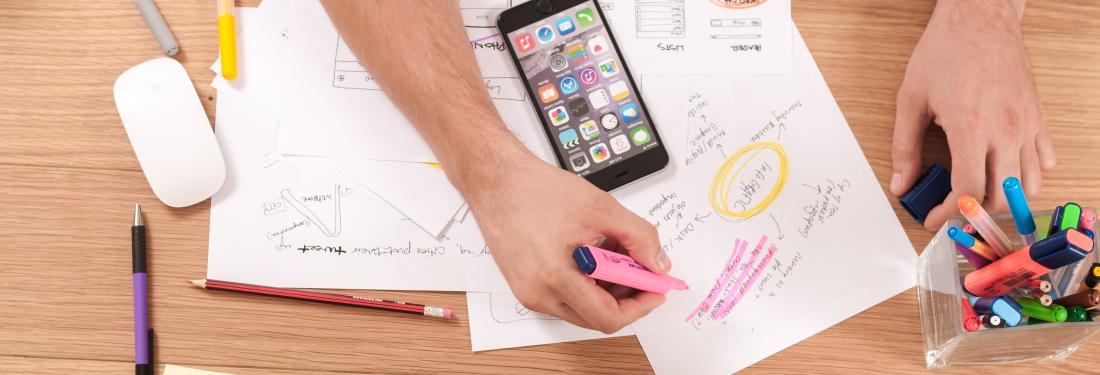
Ok, maybe hate is a little strong. Paper prototypes and sketches have their place in interaction design. For example, they're great for helping to quickly brainstorm various different approaches to a problem at the beginning of a design process. They're also a very fast and cheap way to illustrate a new idea, since most people can draw boxes faster than they can build interactive prototypes. But, in my opinion, they have several serious drawbacks. Before I get too far into this, let me define what I mean by a paper prototype, since I've heard people use the term to refer to everything from sketches on actual pieces of paper (or cocktail napkins in a couple of cases) to full color printed mockups with a polished visual design. In this instance, I'm referring to a totally non-interactive screen, mockup, or sketch of any sort of application that is meant to be shared with customers, test participants, or team members. It can be printed on actual paper or shown on a computer screen, but whatever the viewer does to it, a paper prototype is not interactive. So, what don't I like about them?
Screen vs. Paper
This first couple of peeves apply to screens that are actually printed out or drawn directly on paper. With a few exceptions that I've listed below, I've found this approach to be really counterproductive.
Iterating On a Design
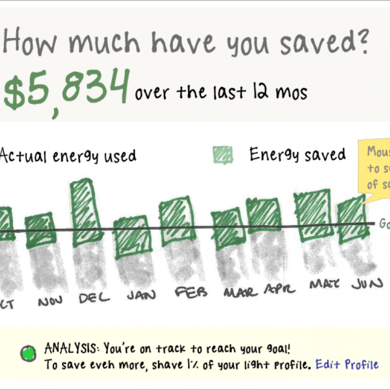
One of the biggest problems with hand drawn sketches on paper has less to do with user interactions and more to do with my work flow as a designer. Sure, sketching something quickly on a piece of paper can be quick, but what happens when I realize that I want to swap two sections of the screen? I can draw arrows and lines all over it, but that gets messy pretty fast. Whenever I want to make any changes to my design, I need to create a whole new sketch. This can mean redrawing the entire screen quite a few times. If I'm creating a design in HTML or any other prototyping tool, the very first version might take a little longer than a quick sketch, but the second through nth iterations are a whole lot faster. And, as a bonus, I can check them into source control, which means I'm a lot less likely to lose my work than if I have dozens of pieces of paper scattered all over my office.
Interacting With Paper
Whether they're sketched out by hand or printed out on paper, people interact with paper screens differently than they do with computer screens. They view them at a different angle. They focus on different parts of the screen. They use their hands to interact with them rather than a mouse and keyboard. Any feedback that you get on a printed design will be colored by the fact that people are fundamentally interacting with it differently than they would if it were on a computer screen. Given all of these drawbacks, there are a few situations when designs printed on paper can be used effectively:
- You are at the very beginning of the design process, and you want to explore a bunch of different possible directions with other team members very quickly before committing yourself to fleshing out one or two specific options.
- You're designing material that is meant to be printed, like brochures, user manuals, books, etc. In this case, you want to know how people will interact with the printed media.
- Your product is an interface for some sort of embedded or small screen device that would be very difficult to replicate in a quick interactive prototype. For example, a screen for certain mobile devices or the heads-up display for a car dashboard might be hard to show interactively in the appropriate context.
- You have several different visual designs, and you'd like to show them all to users at the same time in order to see which one is the most attention-getting. You’ll still need to show the designs on screen, of course, since colors can vary so much between screen and print, but it can be helpful to lay out several pieces of paper so that the various options can easily be compared.
- You need to share screens with people in an environment with absolutely no access to a computer whatsoever. You know, maybe you’re in the middle of a meeting and need to sketch something quickly, or the rest of your design team is Amish, or you are designing in a post-apocalyptic wasteland where the computers are trying destroy humanity.
On the other hand, if you're designing desktop or web applications for standard computers, at the very least, show your prototypes on a computer, even if they are not interactive! [more538] A few reasons why it’s especially important to show interactive designs on a screen:
Animations and interactions
I am an interaction designer. A big part of my job is to determine what happens when a user interacts with a product. Sometimes that's obvious. For example, if I click on a link with some text that reads, "Contact Us," I expect to be able to communicate in some way with the people who have created the product. But is it so obvious? Back in the day when links could only take you to another static web page, sure it was. But now, all sorts of things could happen. I might have different behavior on hover vs. on click. I could be given the option to have a live chat with a rep. I might be presented with an inline contact form so that I don't have to leave the page I'm visiting. The contact form could have some information already prefilled for me based on my present location or account type. There could be animation involved in displaying the contact information. There could be some sort of contact wizard that would change later screens depending on choices the user makes initially. All these interactions are much harder to convey with paper prototypes than with interactive wireframes. Sure, you can make a different screen showing each stage of the interaction, but with anything more complicated than a few steps, your observers can get lost pretty fast shuffling through papers. Having it all working in an interactive prototype allows users to click through and explore naturally. They can also discover things like hover interactions or animations on their own, which are particularly unsuited to paper.
Testing
What? You don't need to test your designs with users? Your designs spring from your brain fully formed and perfect? Well, good for you. The rest of us mortals actually like to show our designs to test participants and get feedback from people who aren't familiar with the product. Now, I've run a lot of user tests. I've run them with working products, interactive prototypes, pictures of screens displayed on computers, pure paper prototypes, and physical mockups of products. I've used prototypes built with everything from HTML to Visio to cardboard. The one constant was that the closer the prototype mimicked the final product interaction, the fewer problems we found once the product was built. And since we recommend iterative testing during development rather than waiting to test until the product is 100% built (you know, just in case your design wasn't entirely perfect the first time around), an interactive wireframe is the best trade off of speed for functionality.
Communicating the design
You can have the best design in the world, but if you don't communicate it effectively to the engineers who have to build the thing, it doesn't matter one bit. Of course, once you've designed all of your static screens, you could paste them into a big spec with extensive documentation about what each button on each screen does and how many seconds an animation is supposed to take and blah blah blah. I've done it when it’s been specifically requested by a client. I've also never met an engineer who was particularly happy to read through one of those three hundred page documents. Besides, just the thought of making changes to every screen in that document every time there's a change makes me tired. An interactive prototype, when built intelligently, is a different story. It allows engineers to see exactly how every element of the design is supposed to work. What happens when you click on a link? Click on it to find out! Is the animation supposed to sweep horizontally or vertically? Take a look! Of course, you're free to add notes to screens as necessary to fully communicate absolutely everything, but the difference between using this lightweight approach and a full design document for reference is night and day.
What's the alternative?
So, what should you use other than paper prototypes? I've mentioned it throughout the post, but I'll be perfectly clear. Your best bet is an interactive wireframe that mimics the behavior of the actual product as closely as possible. It doesn't have to be hooked up to a database on the back end or use real data. It doesn't even have to be fully functional if you're only testing parts of it or if you’re annotating it with notes. But it should make the user, whether they're a test participant, an engineer, or your design manager, feel like they're actually performing tasks with the product. Luckily, you’ll find plenty of products out there that will help you build interactive wireframes with very little technical expertise. You don’t need to be an engineer or a Flash expert to make your screens clickable. My favorite tool is Dreamweaver for creating quick HTML prototypes with basic animations and interactions, but other people have had good luck with applications like Axure and or even PowerPoint (although, that has some serious limitations). There is, of course, one quick caveat. I know I’ve been harping on how closely your prototype should match your eventual product. However, you do not need, and probably shouldn't have until quite late in the design process, a full visual design for your interactive prototypes. Why is that? Well, I've found that making the visuals look too polished can actually focus the user on the aesthetics rather than on whether they can accomplish a task. A lovely or flashy visual design can distract the user from interaction problems that you'd rather find early in the process. For best results, focus on creating a simple, clean wireframe with as much interactivity as you can possibly give it. Your users will thank you for it.


