Move.mil
Making the moving process a breeze for service members
The Defense Digital Service (DDS), a team of digital wizards in the US Defense Department, joined forces with Truss Works and Sliced Bread to give the moving process a makeover for our cherished service members and their families. Moving ranks in the top three most stressful events for service members. It can feel like a labyrinth of paperwork, requests, and approvals for families transitioning between military bases.
We embarked on a two-year journey with DDS and Truss, reimagining the entire relocation process through the military software moving system (move.mil). Our mission: To simplify the moving process for service members and their families every step of the way.
Case Study
A hoop-jumping and waiting marathon.
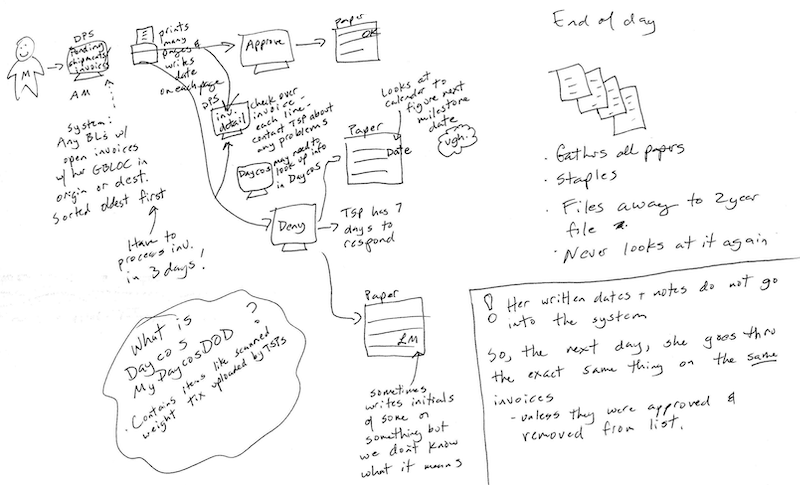
Truss and Sliced Bread kicked off the project by conducting over 100 interviews. We listened to service members’ stories from six branches and consulted with back office staff involved in processing workflows.
The original moving process resembled a marathon, starting with two hours of online forms and a two week wait for approval. But the waiting wasn’t over after the move – it could take three months to reimburse out-of-pocket moving expenses!
Our interviews illuminated blockers, back-office and member-facing communication gaps, and areas where an already daunting process was complicated by a clunky interface. Once we knew what needed fixing, we set out to make things right.
Designing for simplicity and efficiency.
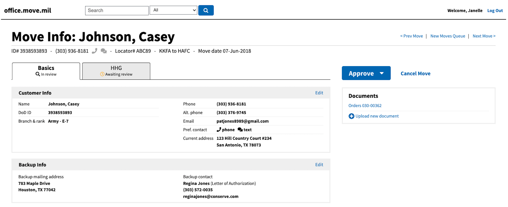
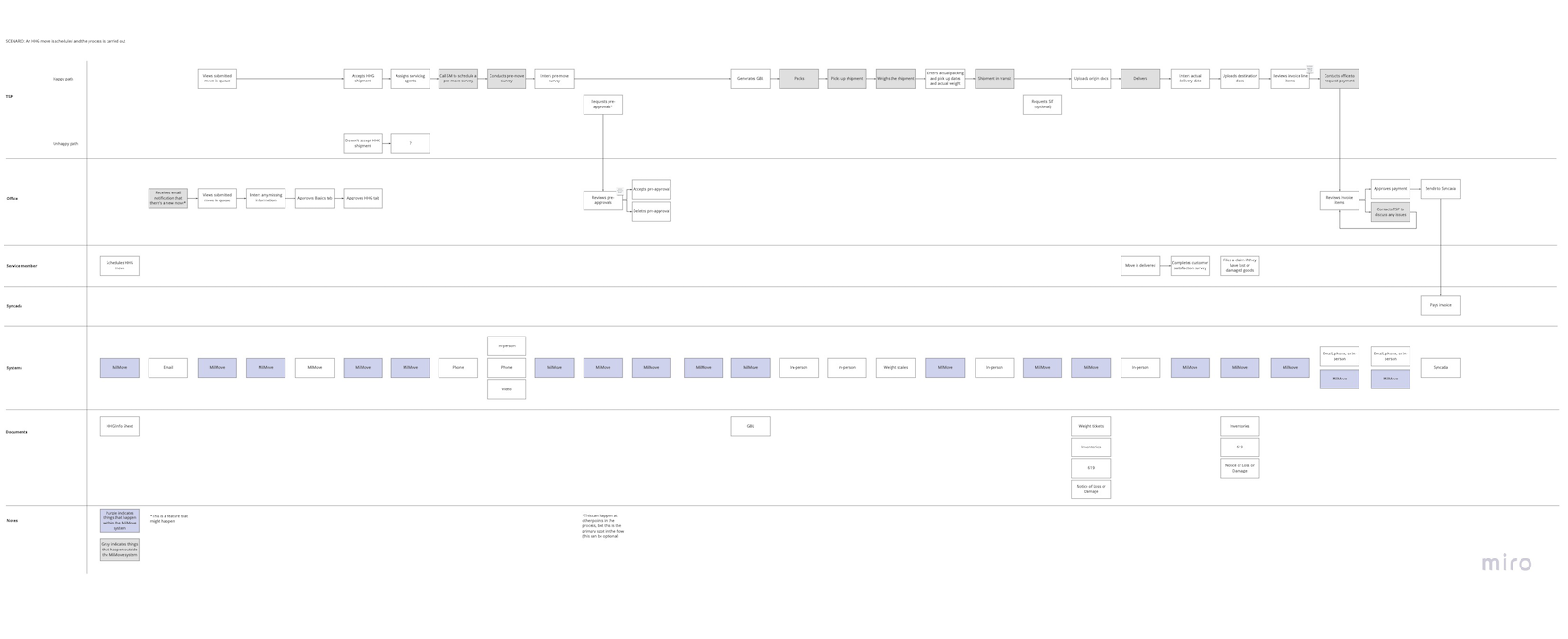
Based on our interviews, we knew we needed a map. We visualized the process from both the service members’ front end perspective as well as the backend operations of the logistics teams. Flow diagrams and site maps became our trusty guides and served as the foundation for new UI designs. But we didn't stop there; we collaborated closely with the project team to improve processes and policies and addressed underlying issues instead of merely papering over them.
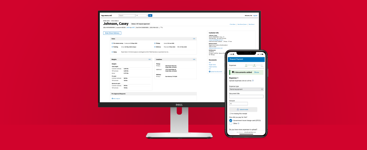
One of the major pain points: service members struggled mightily to determine the weight of their belongings. We partnered with the project team to streamline the overall workflow requirements and created a handy visual guide to help service members submit accurate documentation.
Starting with hand-drawn sketches and Sketch wireframes, we invited feedback from both service and office members. Their valuable insights propelled us forward, transitioning our shared vision into interactive JavaScript prototypes, bringing them to life.
Make my move mobile.
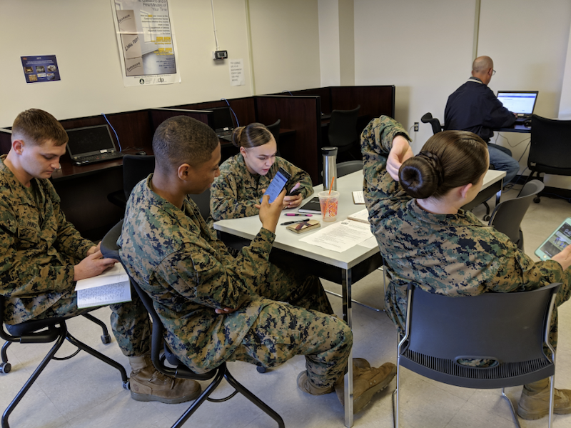
We excitedly put our prototypes to the test with a diverse group of service and office members. Service members were specifically asked to try the prototype on their phones since that was the most common way most members set up a move.
We were sure to include different bases across the country, capturing feedback from a geographical range of experiences and perspectives.
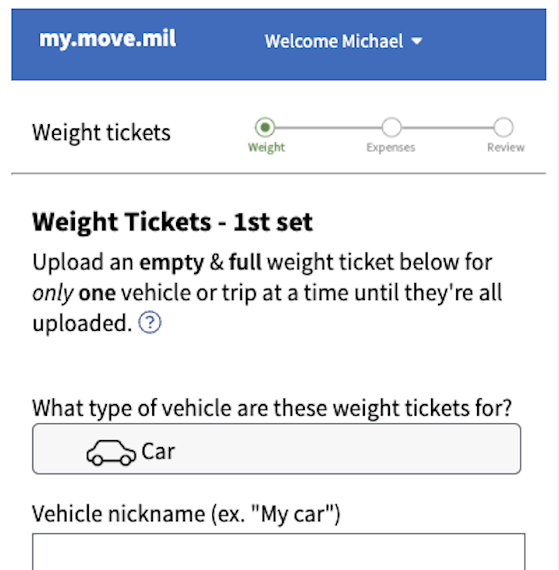
How can we get complete info on the first try?
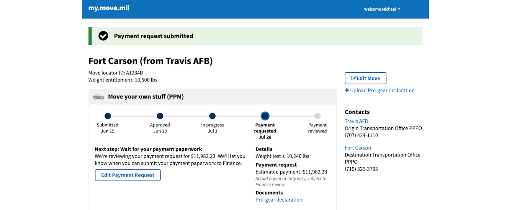
One significant change prompted by user research concerned documentation for reimbursement. In a previous iteration, service members chose the document type to submit first, but often forgot to add any additional docs beyond the first one. To prevent this type of oversight, we revamped the flow to begin with uploading weight tickets and added just-in-time reminders about uploading receipts. After each iteration, we coordinated with Truss engineers to implement our updated designs.
The Results
In 2019, the pilot program took off, transforming the previously laborious two-hour online ordeal and two-week wait into a swift 10-minute online setup with instant processing. Service members facing errors saw a previous 58% error rate dramatically decrease to 12%, while the repayment wait time was slashed from three months to just four weeks.
