Ditch the Rainbows
Color is becoming more important than ever. With the increasing popularity of flat design, designers are less able to rely on 3D buttons, drop shadows, and other crutches that used to make functionality apparent. Of all the formal elements of design, color hits the fastest and hardest. Color communicates the mood of a website or application in a fraction of a second, long before we grasp the semantic content. Color has the power to clarify or confuse how a user is meant to interact with a digital environment and with great power comes great responsibility. I see a lot of websites and apps where the designers just went overboard with color, either splashing it all over the place like Jackson Pollock, or pulling an Ellsworth Kelly and filling the entire page with a garish monochrome. Using just the right amount of color is harder than it might seem. Here, I’ll share some examples of effective and ineffective color use to help you make wise chromatic choices in your own designs.
Why Less is More
We’ll get to websites in a moment, but first let’s think about information design more broadly. Information design is the art of foregrounding what’s essential, while backgrounding or removing what isn’t. Take maps for example. Like websites, maps present a lot of information in a small space, and cartographers must make very shrewd color choices to maximize signal, and minimize noise. But, like web designers, they don’t always get it right. Here’s a map that visual information guru Edward Tufte singled out for its egregious abuse of color in his book Envisioning Information (Graphics Press, 1990):
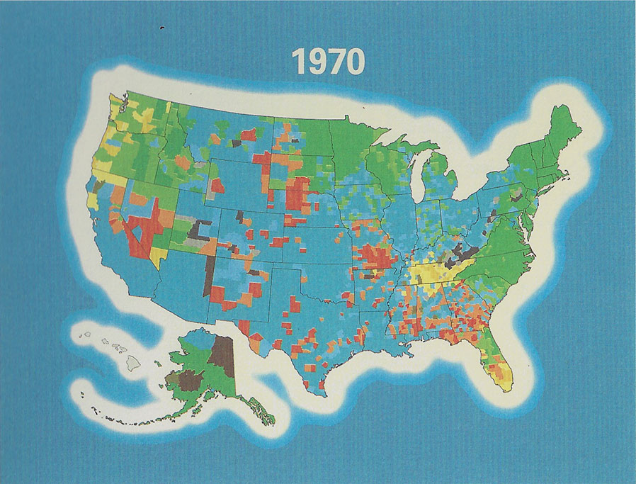
What’s wrong with this map, aside from locating Alaska just to the left of Juárez? Whoever did the inking took the “more-is-more” approach. All colors are equally saturated, and the background blue is the dominant hue, pulling the eye away from the central information at every opportunity. Within the landmass itself, every swatch is bright and loud, and, aside from the inherent attraction of red, no single element stands out from the others. This map has failed to foreground anything. Tufte, the visual information expert, advocates a sparing use of color, ideally against a muted background. See how the structure and function of the buildings and fields in this city plan leap out to announce themselves to the viewer:
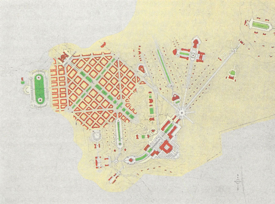
When color is used with precision and purpose it brings focus to pertinent information, while leaving enough breathing room to temper the distraction of background noise.
Using Color in Interaction Design
Judicious use of color is even more important when it comes to designing screens a user is meant to interact with. When we are looking at a web page, typically we are not just soaking in its aesthetic beauty; we are looking for something. The job of a designer is to figure out what things the user is most likely looking for and make those things as apparent as possible, or in the case of marketing sites, to direct the user where you want them to look. Let’s look at an example from Target’s homepage. Now this is not really fair because Target’s branding is all red, which presents considerable challenges. I’d like to pause for a moment and point out that all colors are not created equal. From the bright arterial blood coursing from a wounded centurion’s neck to the vermillion glow of fires in the night, the color red is permanently imprinted in our collective psyche as a sign of urgency and danger. The UI designers at Target do not appear to have gotten that memo.
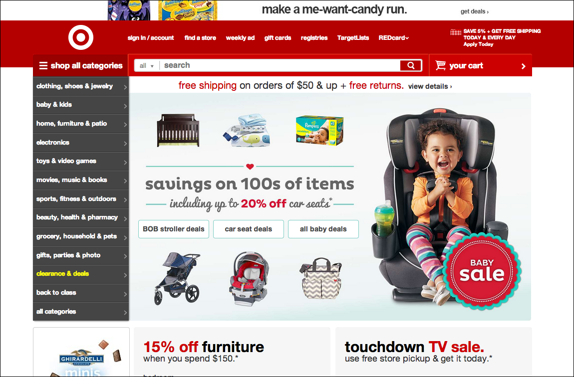
See how the search bar and side nav are superimposed over the header bar in shades of crimson and burgundy that are only slightly off from the carmine red of the top navigation bar. This red abuse is exacerbated by the excessive prevalence of highlighted text, “free shipping”, “free returns”, “15% off”, “TV sale.” There are fires everywhere! The eye is drawn hither and thither with nowhere to land. I have no idea where to click. I’m paralyzed. Old Navy, bless their hearts, does a much better job.
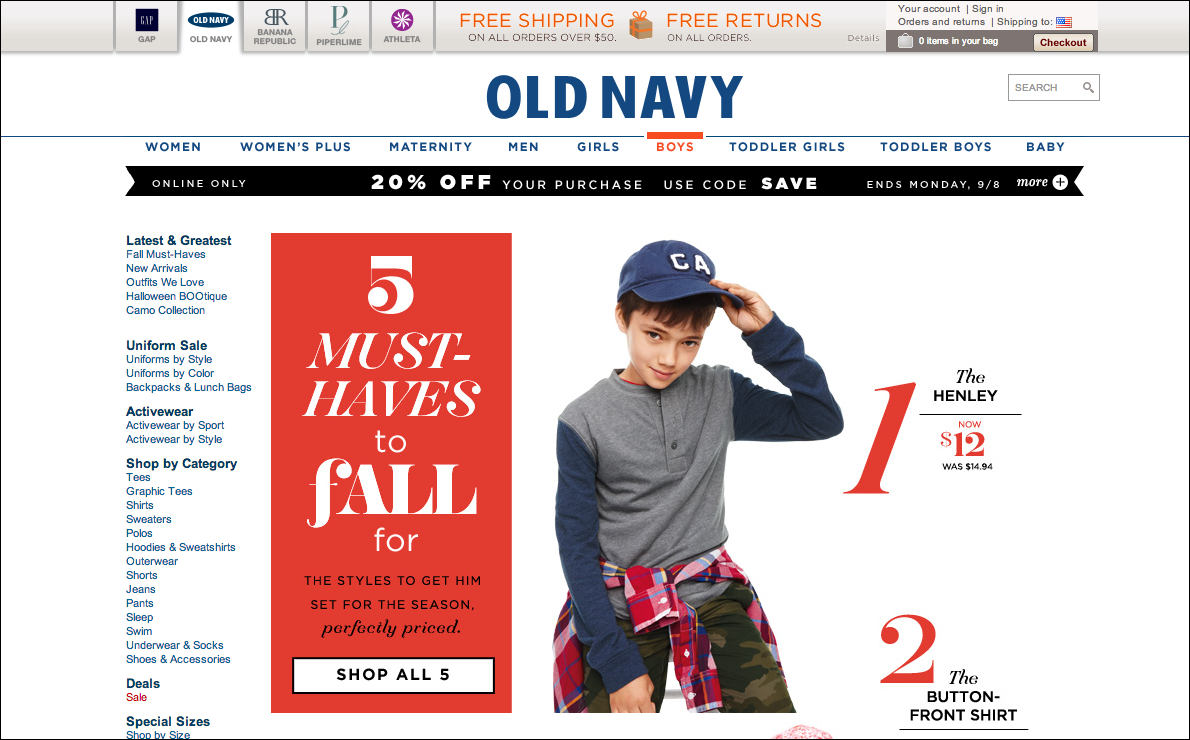
Like the city plan we looked at before, this site avoids clutter with plenty of whitespace. Best of all, they use highlights in a meaningful way. The exact same shade of red, an unsaturated scarlet, is consistent throughout the design, creating a harmonious visual relationship between elements that are actually related. In this case the large color block explains the details of the sale “5 Must-Haves to fall for”, which are then referenced with the red numbers to the right of the model. The subtle highlight of “BOYS” on the main nav stands out in sharp relief from the surrounding elements and reiterates the relationship between the selected item and the displayed content. Good job team!
The Perils of Flatland
A flatter design aesthetic can be a beautiful thing. When done well, it accentuates the expansive space afforded by the widescreen display and offers a distinctly modern functionalism to web design. But the impulse to overuse color presents real danger to a site’s legibility. When thinking about how to use color in your interface designs, I urge you to consider how you are drawing the eye around the page. Like a well-designed workflow, good use of color whisks a user through an interface so smoothly that they barely even notice it is there. Jesse Day is an intern at Sliced Bread and the author of Line Color Form: The Language of Art and Design.