We recently worked on a new energy tracking site to help consumers monitor their energy use and find ways to save money. With President Obama’s recent announcement awarding a few billion dollars in smart grid grants, we expect to see an even larger effort devoted to creating new energy tracking systems and devices. So, let’s save all of us some energy by sharing our top tips for creating a consumer energy portal.
1) Simplicity is key
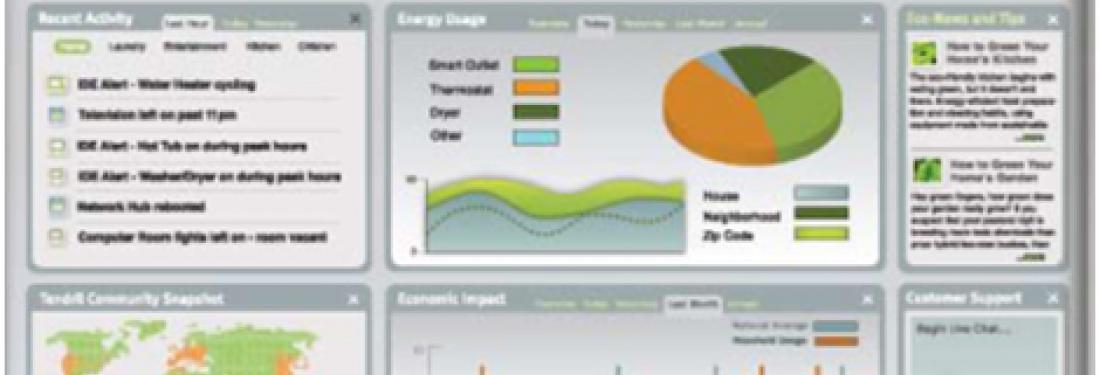
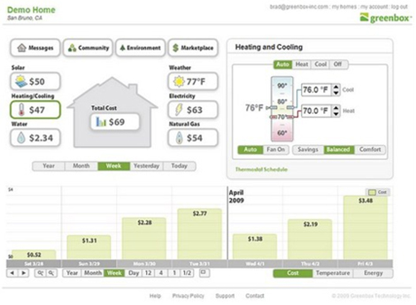
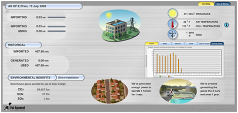
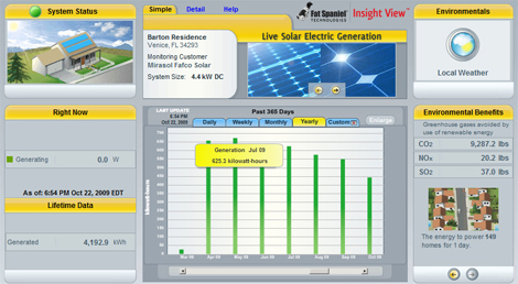
We’re noticing that far too many of the new energy portals on the market are delivering complicated interfaces and busy dashboard-style pages with dense data charts and lots of buttons. Although heavy data, analysis tools, and controls might be interesting to data geeks, most consumers will find this information overwhelming or just plain boring. Consumers don’t want it to be rocket science just to learn to set their thermostat, and they don’t want to spend hours reviewing their usage details just to determine how they can save money. A few examples of interfaces with too much data for consumers: Greenbox
Fat Spaniel
Tendril
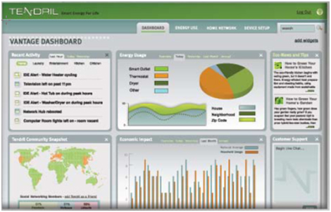
So, we encourage you to simplify, simplify, simplify! Anticipate user’s most common questions, then make it easy to find these answers. Highlight key information in an easily scannable format, and engage consumers with friendly language, like “How much energy am I using?” and “Is my electric bill on track this month?” If you have more data, you can always offer it on drill down for people who want to learn more.
2) Present energy data in meaningful unit equivalents, specifically dollars
Which in-home energy device would you want to use in your home?
Option 1
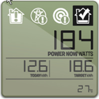
Option 2
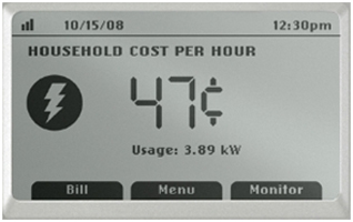
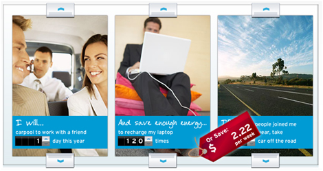
I bet you chose Option 2. To engage consumers, phrase information in a way that makes sense to them. What we say has to be both measurable and meaningful. Consumers do not understand the electricity unit of ”kwH”, unless they’ve had considerable experience with it. And the words “tons of carbon” are just as meaningless even to those who are in the industry. Instead, all energy data should be presented in terms of dollars ($), with kwH and other meaningful equivalents shown as alternative views that can be visualized. For example, “You’ve saved $53.44, or enough energy to watch 362 hours of TV.” Check out Chevron’s “Energy Generator” as another great example of how to present meaningful unit equivalents that consumers understand.
3) Consider a “new user” experience
Most consumers have not had a lot of experience seeing detailed analysis of their energy data, so there is going to be a 3-6 month period of active learning for new users. During this time, users are going to be interested in identifying some basics about their energy usage. For example,
- How much energy do I typically consume during a single day?
- What is the impact of different items and behaviors in my home?
After this initial learning period, consumers will have a good sense of the basics that will remain fairly static over time, and will start shifting their focus to a different type of monitoring. For example:
- Is my energy usage on track?
- How does my usage now compare to my usage in the past?
We suggest that you recognize this consumer learning curve by considering a “new user” experience for your consumer portal. The purpose is to educate users on their energy basics and to appropriately highlight information that is most relevant while they’re still learning, but might remain static overtime or become less interesting after initial use. Then, after this initial ramp-up period, keep users engaged by presenting an ongoing use experience that highlights the dynamic information they want to continue monitoring overtime.
4) Deliver proactive recommendations with bottom-line savings
Consumers want to know what concrete steps they can take to reduce their energy consumption, and they want to know what impact those steps will have on their bottom-line savings. Our research has shown that people are highly concerned and knowledgeable about environmental issues, but their primary motivation is still saving money. We recommend creating a predictive savings calculator based on actual energy usage that would allow users to see how various changes would affect their consumption and bill. Users could even use this calculator to help convince other household members to make the behavioral changes that matter most for their bottom dollar. Will the calculator show you which trade-off is right for you? Probably not, but at the very least, it will provide you with your top options for having the biggest impact on your bottom dollar. You can take it from there.
5) Offer a highly-visible, integrated in-home solution
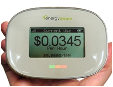
In addition to creating a web portal for access to consumer’s historical data, we suggest also providing a highly visible point-in-time meter for integrated placement within the home. Consumers are looking for visible, real-time meters that can become an effortless part of their daily routines – much like their thermostats – because they know that everyone in their house has to be able to stay on track with one simple glance. Otherwise, it will be “one day up then one day down” instead of a forward-moving effort by everyone involved. Also, remember what we’ve learned– keep the device simple, and present energy data in dollars and other meaningful equivalents, such as the following example from Energy Aware.
We hope you found these tips in creating consumer energy portals helpful. Think about it... talk about it... try it... and get out there and create your own green power designs so that others can give it a try, too.


