ChargePoint

UI for electric vehicle charging station
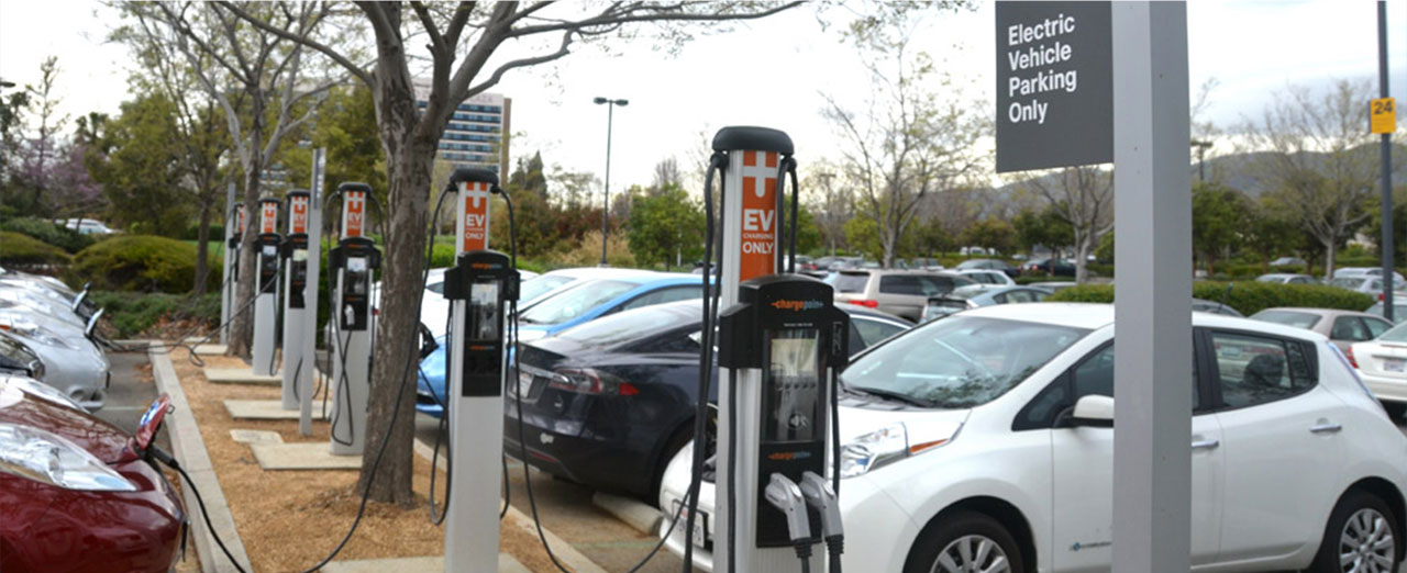
ChargePoint, the world’s largest electric vehicle (EV) charging network, asked us to design their new EV charging station. Right from the beginning, we thought that an entirely new form of locomotion demanded an entirely new, clever and entertaining charging experience. And little did we know there’d be an animated cowboy waiting for us in the final design.
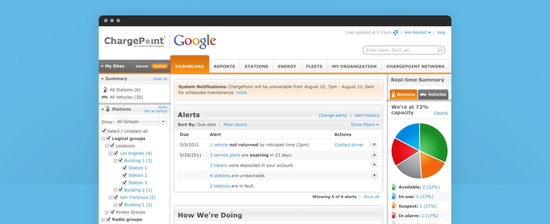
The charging station was one of several projects Sliced Bread has done for ChargePoint, including a mobile app for EV drivers and a web-based application for station administrators.
"The special thing about working with Sliced Bread was the range of talent they assembled to support ChargePoint's product development. At ChargePoint we provide a very broad range of products from a very sophisticated charging station network management system used by experts to the individual charging stations themselves whose user interfaces have to be fun to use and support completely non-technical folks that just want to charge their plug-in cars. Sliced Bread brought together a great team that handled all of those product user experiences."
– Tom Tormey, VP Product Management
Case Study
1. Needfinding
Getting in and getting out, pronto!
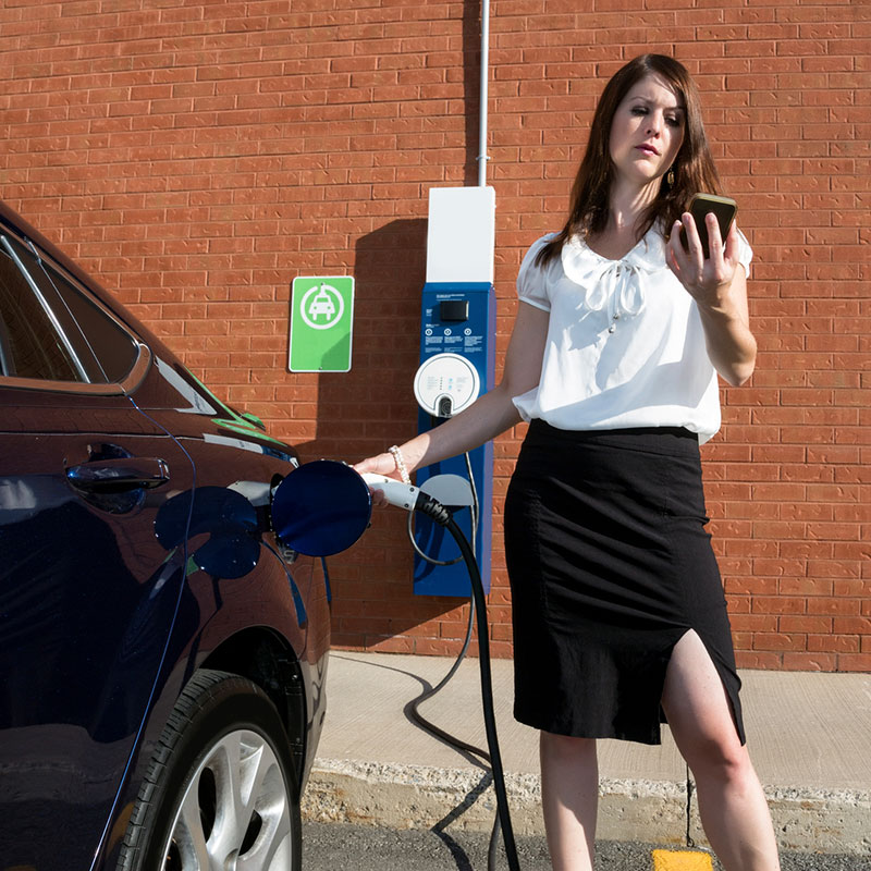
We talked to EV drivers and, to put it mildly, we heard a lot of frustration about charging. The main user gripe was about speed -- let’s get the show on the road already.
We also observed that repeat users were annoyed by unnecessary steps, first-time users were confused about the entire process, and all users were suffering from some level of “Range Anxiety.” (How am I going to get home if I can’t find an open charger?)
Therefore, a successful solution had to be fast, flexible, hands-on and proactive. Plus, EV owners saw themselves as innovators and expected the charging station to be as cool as an air-conditioned cucumber.
2. Prototyping
Let the sketching begin
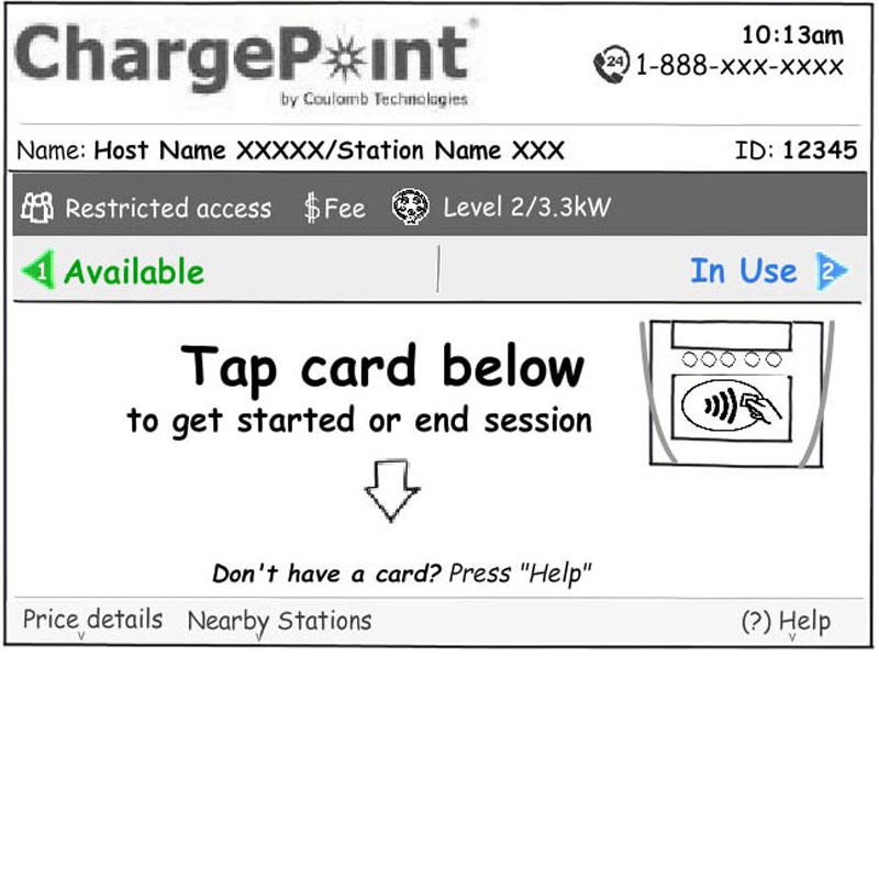
Time to design. We kicked off the process by creating quick sketches and wireframes that users could interact with. A few key elements of our solution were:
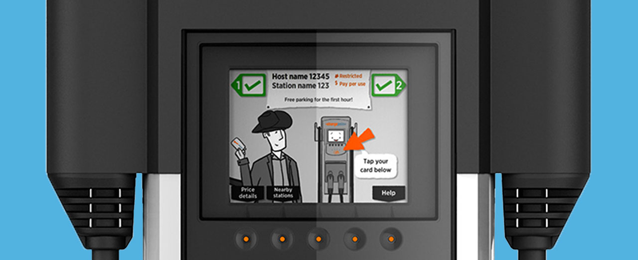
- Short, animated instructions for first-time users (experts could skip the animations, obviously)
- Help screens that proactively let users reserve that particular station at a later time or find other nearby stations that were available
- Glanceable elements showed a station’s availability upon drive-by
3. Testing
Stand back, we're going to try duct tape
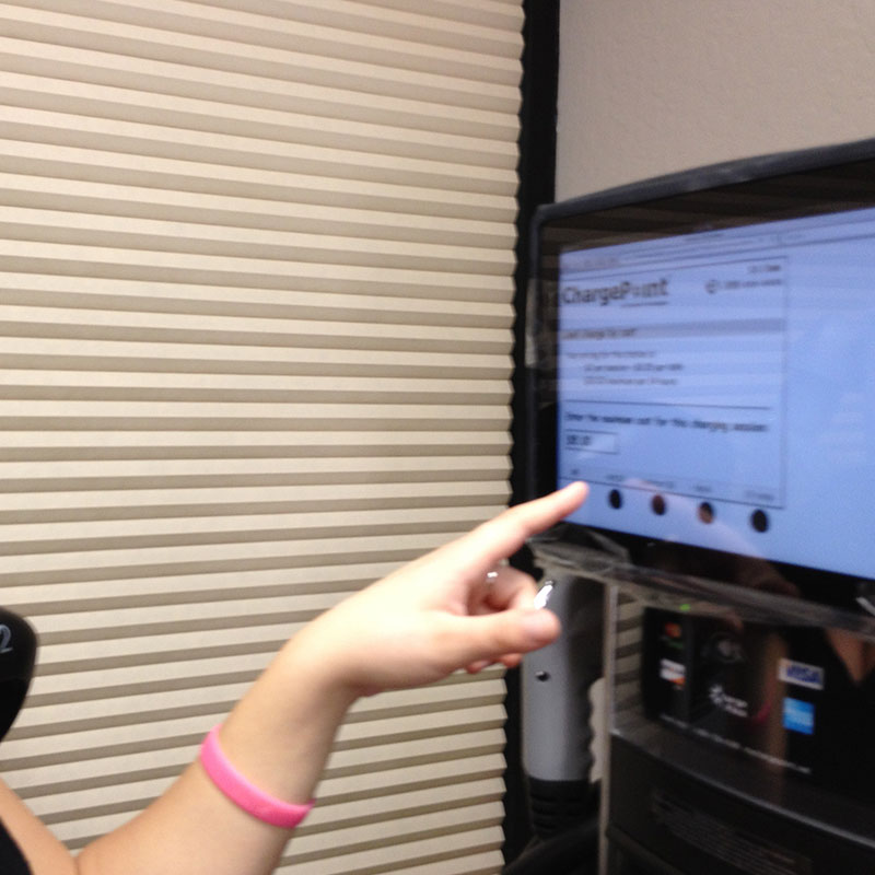
The great thing about prototypes is that they can be made out of just about anything. We built the first ChargePoint prototype by taping a tablet to an older charging station model. Simple but effective, don’t ya think? The testing led to key improvements such as shortening the animations and changing the button labels from icons to text for clarity.
4. Refining
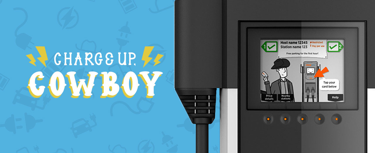
Charge up, Cowboy!
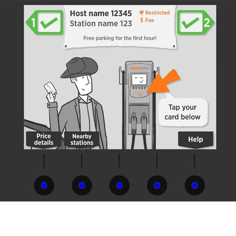
And finally, we meet the cowboy. In order to transform the interaction into a cool, entertaining experience, we created a funky storyline complete with a talking, animated cowboy.
We used bright colors to draw the user’s eye to key functional elements and kept the other non-essential elements a duller shade of gray for contrast.
In the end, we wanted the design to reflect the attitude of EV drivers: fun, entertaining and living somewhere on the edge of today and tomorrow.
The Results
The new CT4000 animated charging station launched to the public in July 2013 with hundreds of orders already placed by excited customers.
Ride on, Cowboy. Ride on.
