TRC
A message in a prescription bottle
Pharmacists have it rough. They’re trained like doctors and treated like sales clerks. The most rewarding moments of their job is when they get to help and meaningfully interact with patients. And keeping up with their craft can be tough. TRC’s Pharmacist’s Letter and Prescriber’s Letter are beloved sources of drug information for professionals across the nation. The publications keep medical professionals up-to-date on the expertise needed to deliver high-quality care.
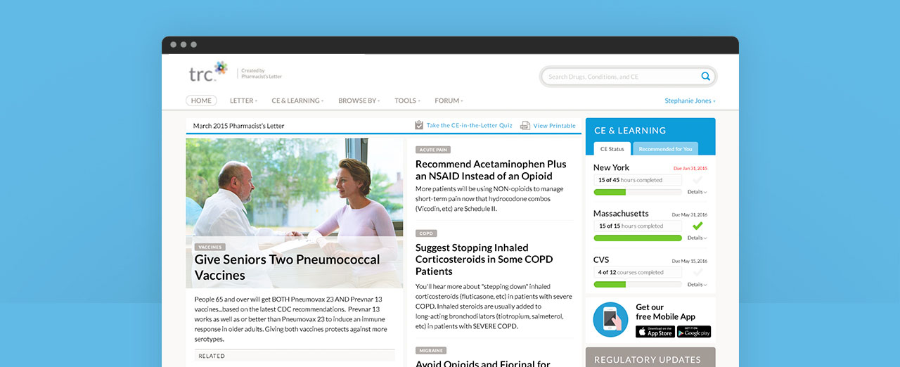
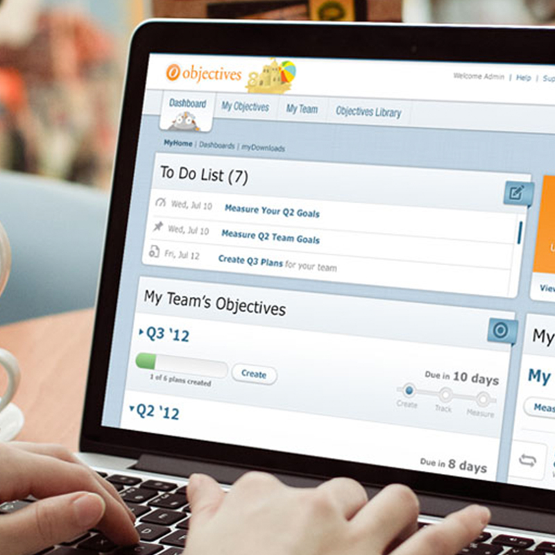
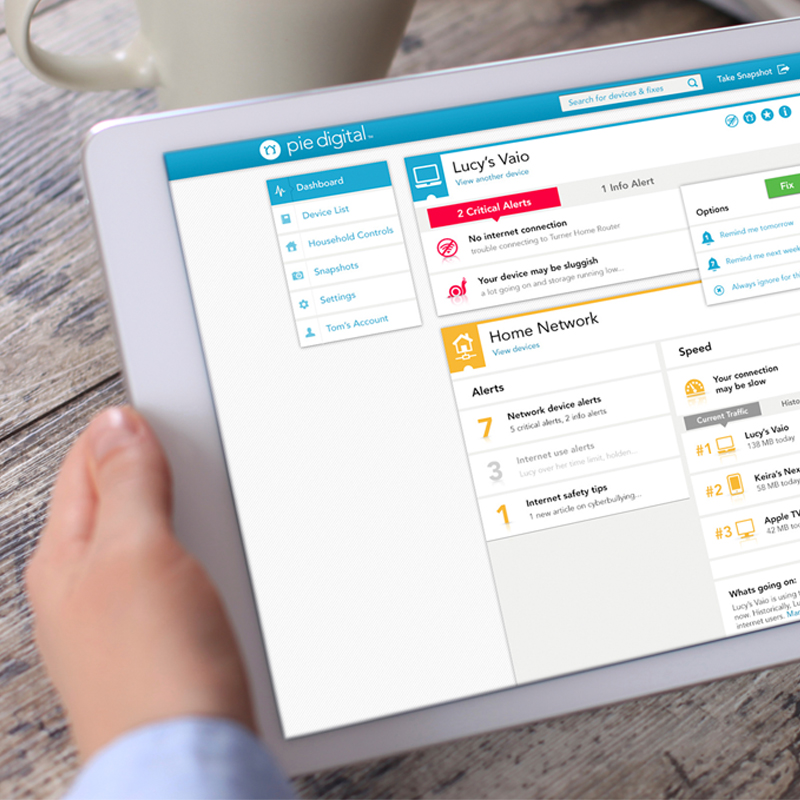
TRC came to Sliced Bread for a complete overhaul of their web and mobile user experience. It was a big project: we designed over 100 separate wireframes and conducted tons of user testing. We provided TRC with a comprehensive, extensible design system that takes their beloved products to the next level.
"The Sliced Bread team is creative, collaborative, brilliant, and fun! They created a visually beautiful, easy to use, professional design on time and under budget."
– Joe Hogan
Case Study
Casting a wide net
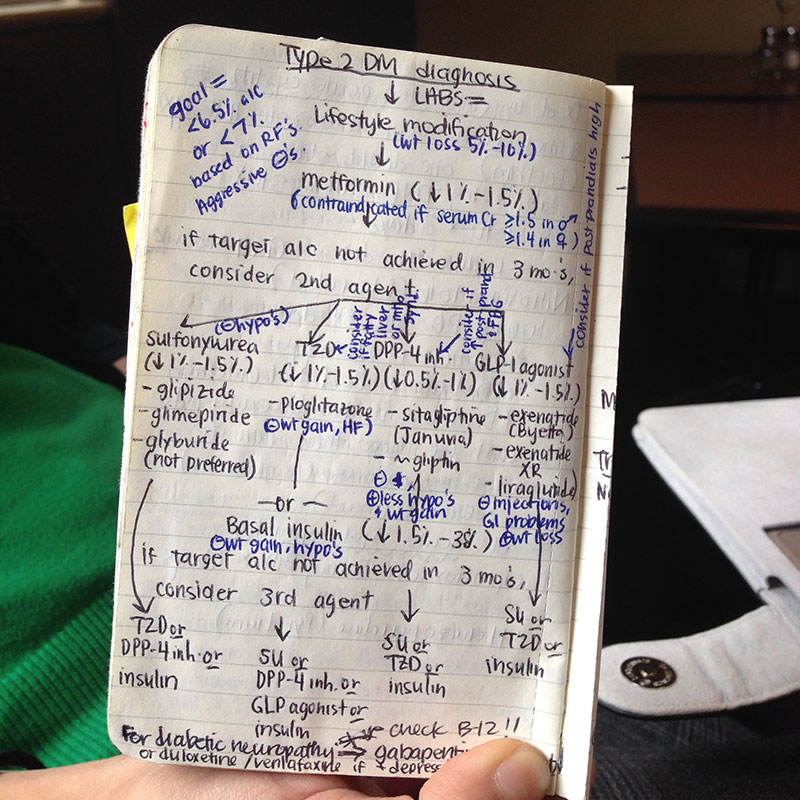
With so many people involved in the process of writing and fulfilling prescriptions, we recruited a diverse group of pharmacists, doctors, nurse practitioners, and pharmacy technicians to give us input. They gave us a glimpse into how busy things could get trying to juggle patient interactions, finding the most-up-date reference information, checking for potential dangers, handling paperwork, and writing or filling prescriptions.
Most importantly, we observed that there were two distinct ways of reading the Pharmacist’s Letter: some like to sit down and read through the entire Letter at their leisure while others read it in bits and pieces whenever they can. We also discovered that readers had trouble accessing archived information. These insights informed our entire design process.
Sending the samples to the lab
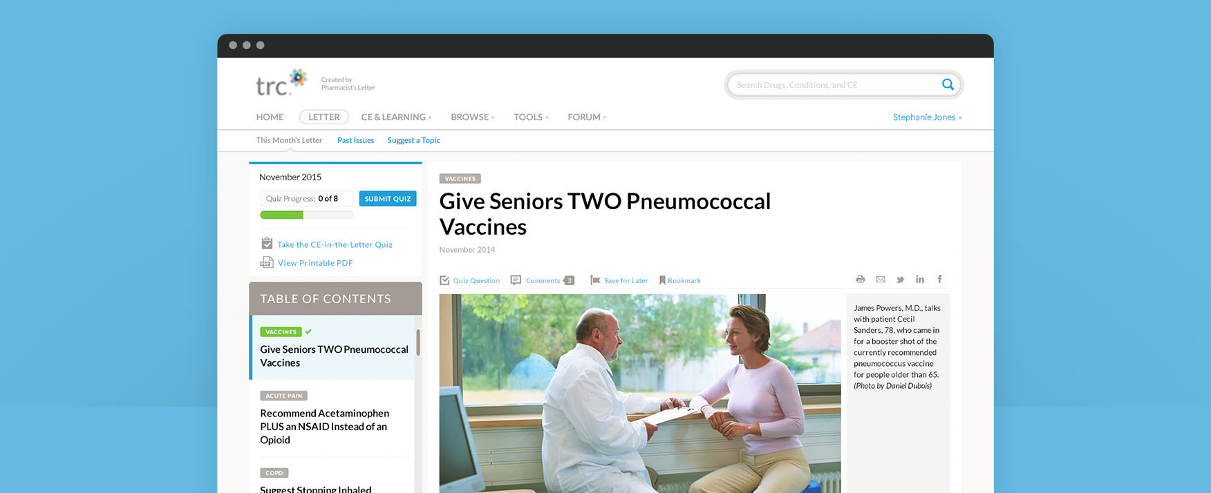
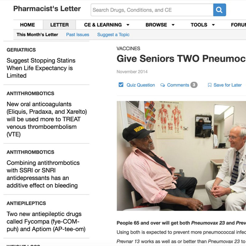
First, we needed to tackle the pesky issue of creating a unified reading experience that both mimicked the wholeness of the physical format and offered a way to ingest the information in pieces. Then we moved on to unlocking the treasure trove of archived content, tuning up the design for search, and overhauling the information architecture.
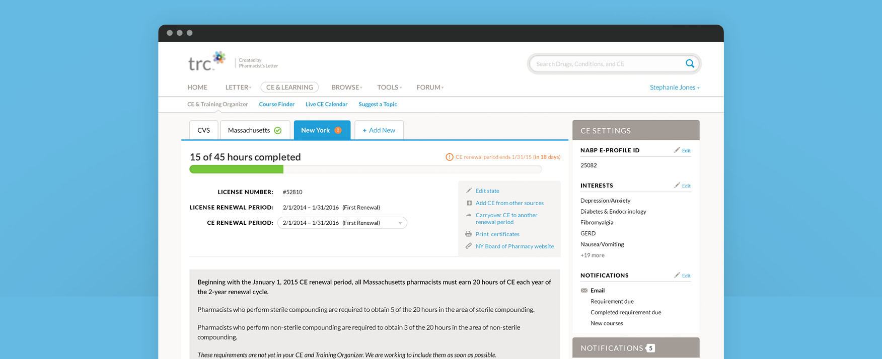
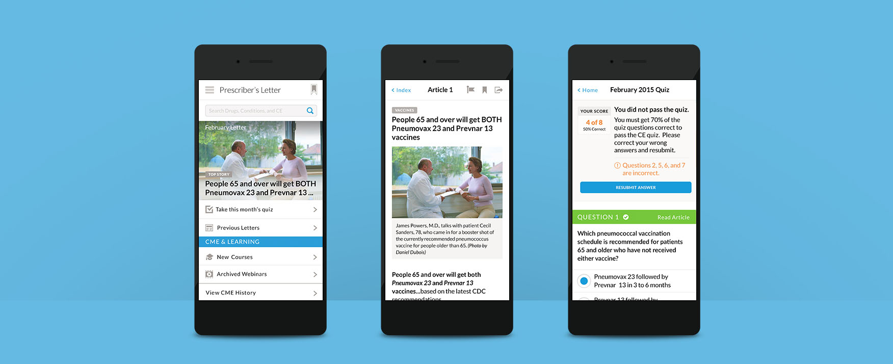
TRC also makes it as easy as possible for subscribers to continue their education and stay current with Continued Medical Education (CME) certifications just by reading the monthly Letter and taking a quiz. Redesigning TRC’s CME offering was a balancing act between regulatory requirements and user-friendly design.

We’re going to be here for a while
Like we said before, this was a big project. Like, an all hands on deck, everyone in the office stays late and orders Thai food project. But it was those extra rounds of user testing that gave us new insights that we never would have never known on our own and allowed us to hone and perfect the final designs.
For instance, our first prototype used a progress indicator so users could keep their place if they were interrupted. Sounds like a good idea, right? Guess again. In testing, we learned that pharmacists are extremely methodical and thorough. (Can someone say Type A?) And what we thought was a helpful little tool actually made the pharmacists anxious because it told them they had left off before they’d finished.
A remedy for information overload
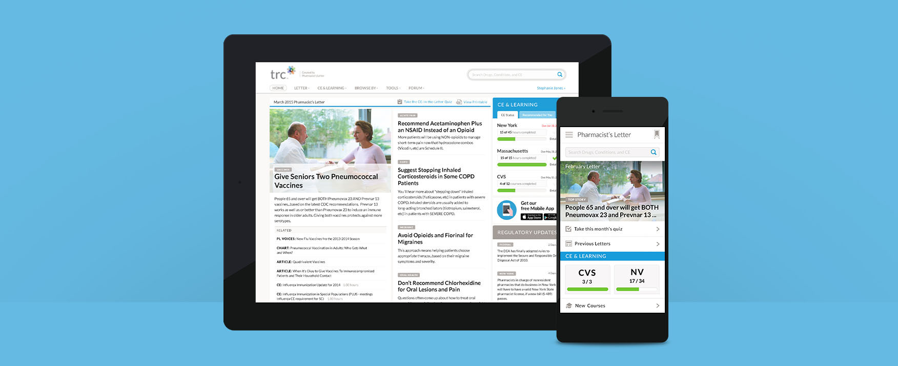
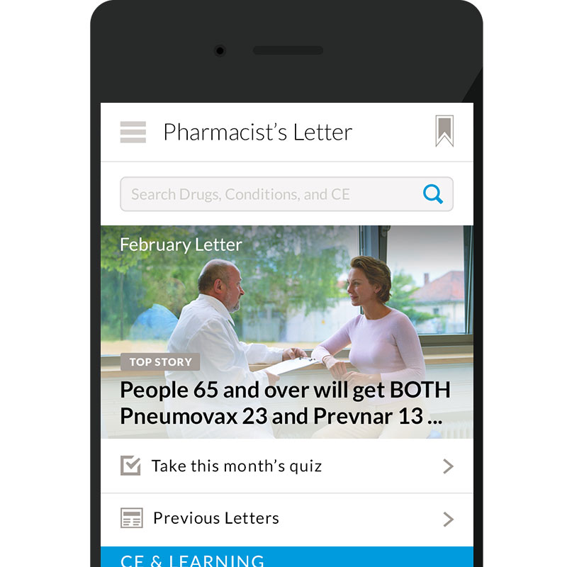
After several rounds of design iteration, we nailed the interaction and tuned up the information architecture for the web and tablet designs. It was now time for us to translate all that goodness to a smaller format: smartphones. And this was no easy feat given the content-rich product. It felt like trying to cram 102 clowns into a compact car. We tested several different ideas for balancing the Letter and continuing education on the small screen and, after a bit of hard work, we found an approach that worked and refined the details.
Our visual design focused on creating a clean, trustworthy, and modern look that was right for all TRC content types. Finally, we incorporated their concurrently created branding into our redesign.
The Results
We created a comprehensive, flexible design system to accommodate TRC’s numerous content offerings, carefully tailored to meet the needs of pharmacists and prescribers. We delivered 114 separate wireframes, detailed interaction specifications, and a complete visual design system.
TRC has begun rolling out the new designs to the delight of pharmacists and other medical professionals.
